User Research · Interaction Design · Iterative Prototyping
Kiwi
Turn scattered events into a fun, guided journey to get and stay connected on and around campus.
Contributions
❥ UX/UI Design
❥ Information Architecture
❥ Study evaluation
Outcome
❥ Interactive Figma prototype
The question
How can we connect students with each other?
Students needed a clearer way to discover campus activities and enough social context to decide whether joining felt right. A small study helped turn that gap into a focused product opportunity.
01
Listen beyond the lecture hall
We started with a survey to see how students currently discover activities, where information gets lost, and what keeps them from joining. Quick interviews added the stories behind those responses: missing the right post, not knowing what an event will feel like, or hesitating to arrive alone.
Together, the methods revealed that this was not only an information problem. Students needed a clearer view of campus life and enough social context to decide whether an opportunity felt right for them.
Patterns at a glanceShow the strongest survey responses, recurring discovery channels, or common barriers.
"Since moving to Germany, I've found student life much quieter than what I was used to. (...) [O]pportunities to meet new people feel less frequent." — International student
The story behind the answersIt can be hard to meet new people or even find events where this would be possible.
02
Turn findings into student personas
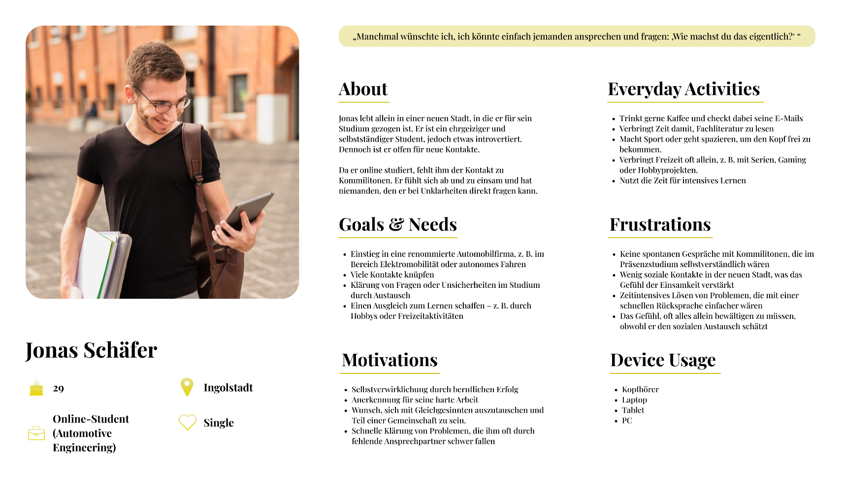
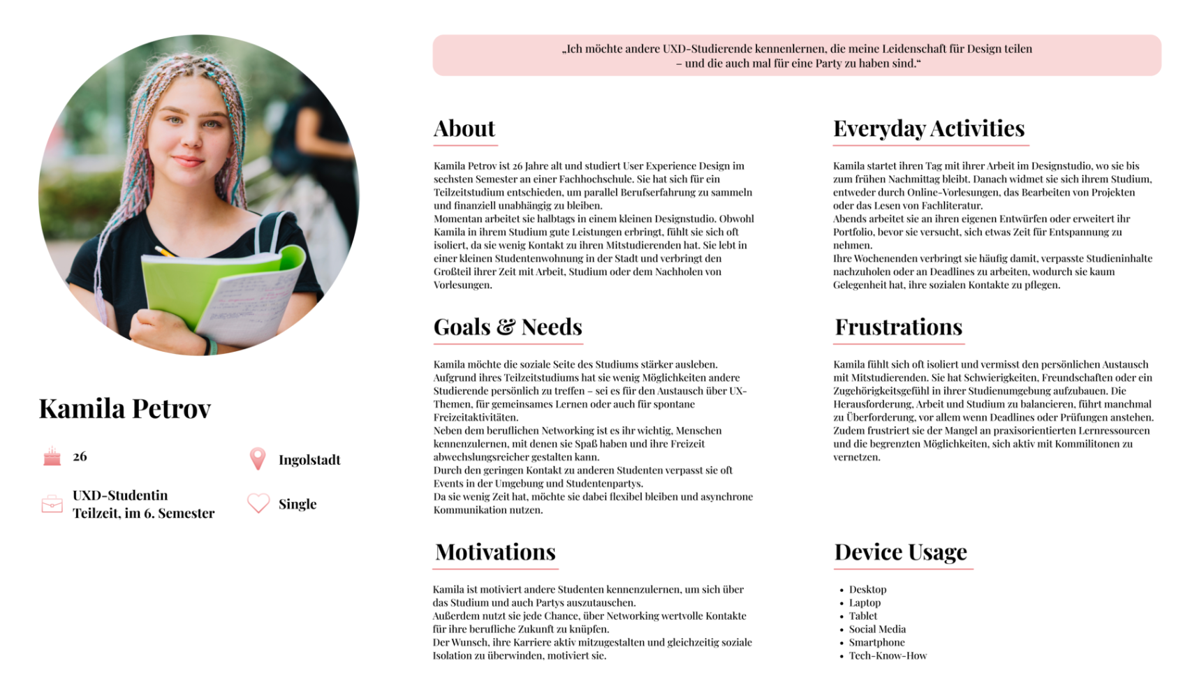
We translated survey and interview findings into two personas, Jonas and Kamila, to make different student experiences concrete. Both want more meaningful contact with peers, but new surroundings, busy schedules, and uncertainty about joining make campus life harder to access.
Their stories showed that Kiwi needed to do more than list events: it should help students find relevant activities and understand what joining might feel like.
Persona: JonasA student new to the city who wants peer connections and quick answers, but often feels isolated.
Persona: KamilaA part-time student balancing work and study who wants to meet peers and join more campus activities.
03
Build, review, and iterate
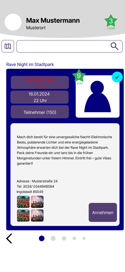
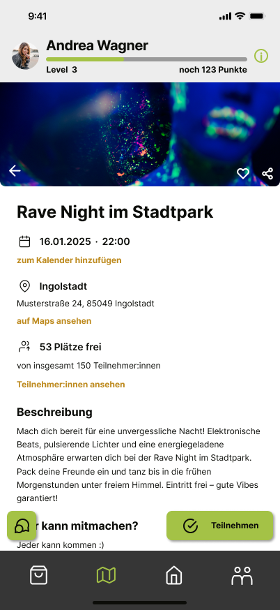
We refined the Rave Night event screen from a compact, game-like card into a structured mobile detail page. The final version separates the date, location, available places, and description, while making calendar and participation actions easy to find.
This iteration puts the information students need to decide whether to attend ahead of profile and game details, creating a clearer path from discovering an event to joining it.
Before...Profile and game progress compete for space with the event details and acceptance action.
...and afterScannable information sections make the event easier to evaluate, with participation actions visible at the bottom.
04
Make the city feel alive
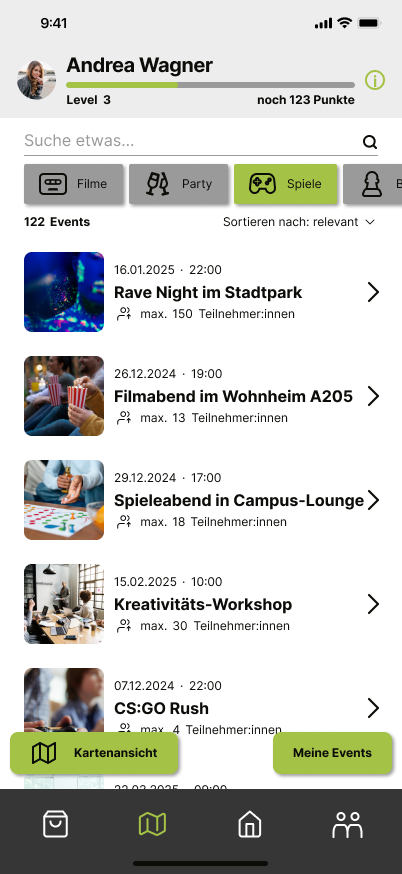
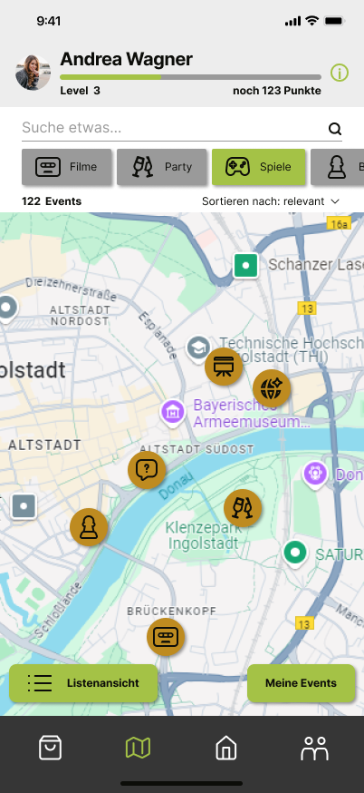
Kiwi uses lively color, familiar category icons, and event photography to make discovery feel closer to browsing campus life than navigating an administrative portal. Students can scan a sorted event list or switch to a map to see activities around Ingolstadt.
Both views keep the essentials visible—what is happening, when, and where—while category filters and a personal events area help students find a route into activities that interest them.
Browse the event listPhoto-led event cards and category filters make upcoming activities easy to scan and sort.
Explore events on a mapMap markers show where activities are happening, offering a location-based alternative to the event list.
The outcome
One connected journey from campus buzz to showing up.
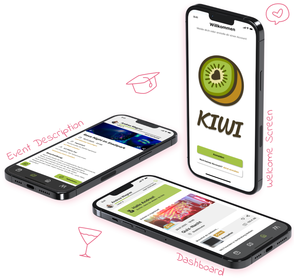
The final interactive prototype turns the research into a complete student journey: a welcoming introduction, interest-led discovery, a focused dashboard, and event details that help students decide what feels worth joining.
Listen
A survey and quick interviews grounded the concept in how students actually find—and miss—campus activities.
Iterate
Flows, hierarchy, and key screens developed through multiple versions rather than a single visual pass.
Connect
The interactive prototype brings onboarding, discovery, and decision-making into one coherent experience.
Learnings
I learned to design for the decision, not just discovery. Students need more than an event title; clear details and social context help them decide whether joining feels right. The personas Jonas and Kamila helped me focus the experience on relevant activities, useful event information, and more than one way to explore.

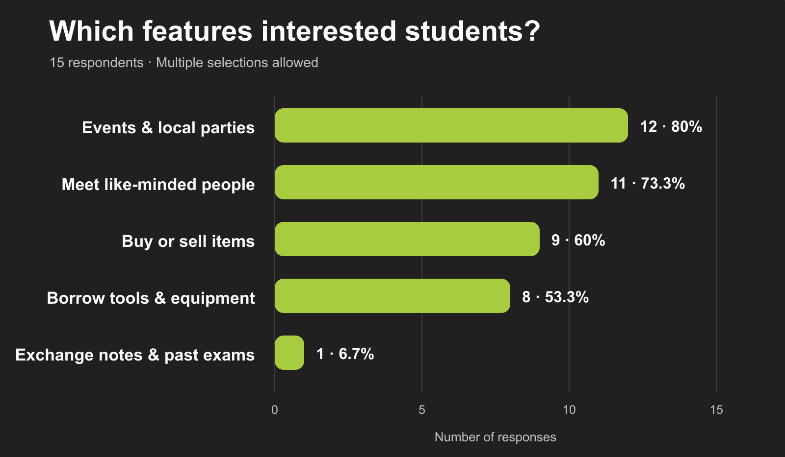 Patterns at a glanceShow the strongest survey responses, recurring discovery channels, or common barriers.